Getting Started into Grid in CSS
Table of Contents
Introduction
Early in my carrier, I am using CSS, When i came to frontend development, But using only few things which is needed for my works, Things like flexbox and other css stuff like positioning layout, But not gone into grid concepts or deep understanding how its works for the layout mode, On the current 2024 year when i purchased the course css-js-dev from josh, I decided myself to have mental model how its works and to learn the unlearned concepts, Which i never came across
What is Grid
Grid is one kind layout mode, Which allows to create the responsive design by using rows and columns,
.some-example {
  display: grid;
}
Grid Layout Mode
In the browser you can check grid layout, By Inspecting the element and click on the grid tag
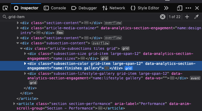
When you click on the grid tag, You will see the layout and its number,
In the grid you needs define where needs flow the primary thing, Like in flexbox saying flex-direction whether its row or column, Like wise in the grid also you needs to define whether its row or column, When you don't define anything by default it will take as row,
- When grid takes by default direction is know as implicit grid,
- When we define by ourself is know as Explict grid
Example Implicit grid
  .some-example {
    display: grid; // implicit grid because we did not say whether row or column
  }
Example Explict grid
  .some-example {
    display: grid;
    grid-auto-flow: column;
  }
Alignment
Alingment is about when using the grid, How the element should be occupy the space,We can align the column of grid like the flexbox, justify-content, We align the element of columns by defining its unit space, For example check below code
  .some-example {
    display: grid;
    grid-template-columns: 20%  80%;
  }
Grid supports the gap properties also
  .some-example {
    display: grid;
    grid-template-columns: 2fr 3fr;
    gap: 1rem;
  }
From the example code, We specified two columns, First column takes 20% and second column takes 80%, Using this kind method can cause problem when resizing because first column never shrinks, So solution for this we needs to use fr , fr stands for fraction, fr is like a flex-grow
  .some-example {
    display: grid;
    grid-template-columns: 2fr  3fr;
  }
- From the above example code there are totally 5 unit space
- first column takes 2 / 5 and the second column takes 3 / 5
- fr it takes that distributes available space
- we can use px,rem,% for adding the unit space
Areas
Grid has feature of defining areas, Naming the region through areas and assigning those areas to element,
  .some-example {
    display: grid;
    grid-template-areas:
    'sidebar header'
    'sidebar main-content';
    grid-template-columns: 1fr 1fr;
  }
Grid Properties
- min
- max
- clamp
  .some-example {
    display: grid;
   grid-template-columns:
      minmax(50px, 1fr)
      minmax(250px, 1fr);
  }
From the code example
- First column should never shrink below 50px
- Second column should never shrink below 250px
In CSS Grid there are two appoarches can be followed
- Fluid Appoarch
- Responsive Appoarch
Fluid Appoarch
.some-example {
  display: grid;
  grid-template-columns:
    repeat(auto-fill,1)
}
Responsive Appoarch